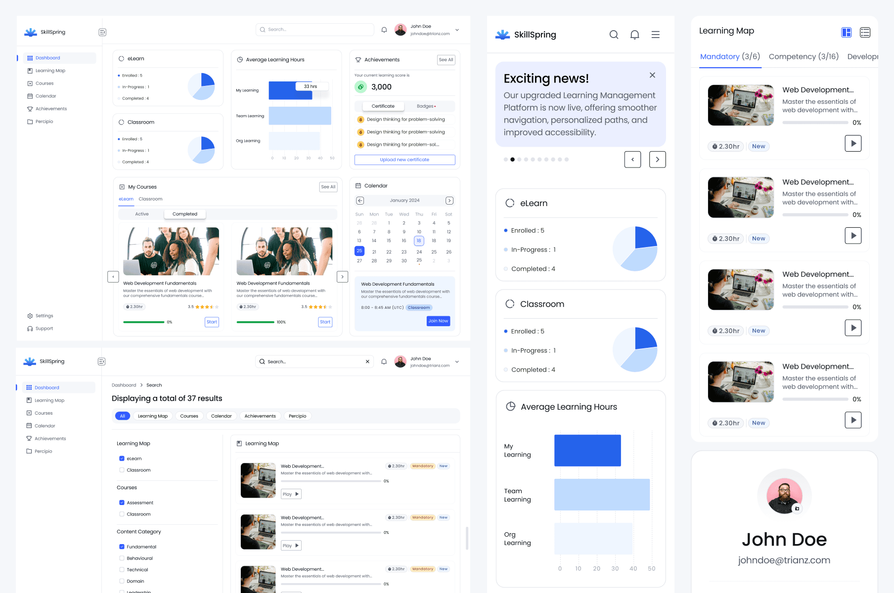
Enterprise Software (B2B / SaaS)
Designing a Scalable Enterprise LMS from Scratch
Replacing a legacy, desktop-only LMS with a search-first platform that works across devices — and actually keeps learners coming back.

Role
Research, Wireframes,
Design System,
Dev Handoff
Team
Product Designer,
2 Product Managers,
5 Engineers
Duration
6 Weeks
Background & Problem
The old LMS made people work to find anything. Course discovery ran on manual browsing and a search that returned inconsistent results, so as the catalog grew, finding the right course got harder, not easier. It was also desktop-only — a problem for a workforce that increasingly wanted to learn on tablets and phones, in the gaps of a working day.
To ground the redesign in something real, I ran a user survey and a competitive analysis of other LMS platforms. Three gaps came back clearly, and they set the direction for everything that followed.
38%
Relied on browsing categories instead of search to find courses.
46%
42%
Said course content was hard to navigate and find
Information Architecture
I restructured the platform around a few clear sections, so discovery, active learning, and progress each had an obvious home.

Key User Journey
The core flow follows a learner from finding a course to starting it. Courses stay reachable from both the dashboard and the side navigation, so there's always more than one way in.

Solution 1
Making Courses Easy to Find
A search-first approach allows users to quickly explore relevant courses.Structured results and suggestions guide them to the right content effortlessly.


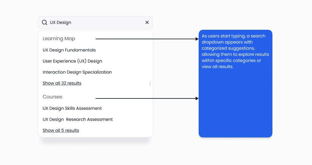
Grouping results into categories enables users to directly access the most relevant section.


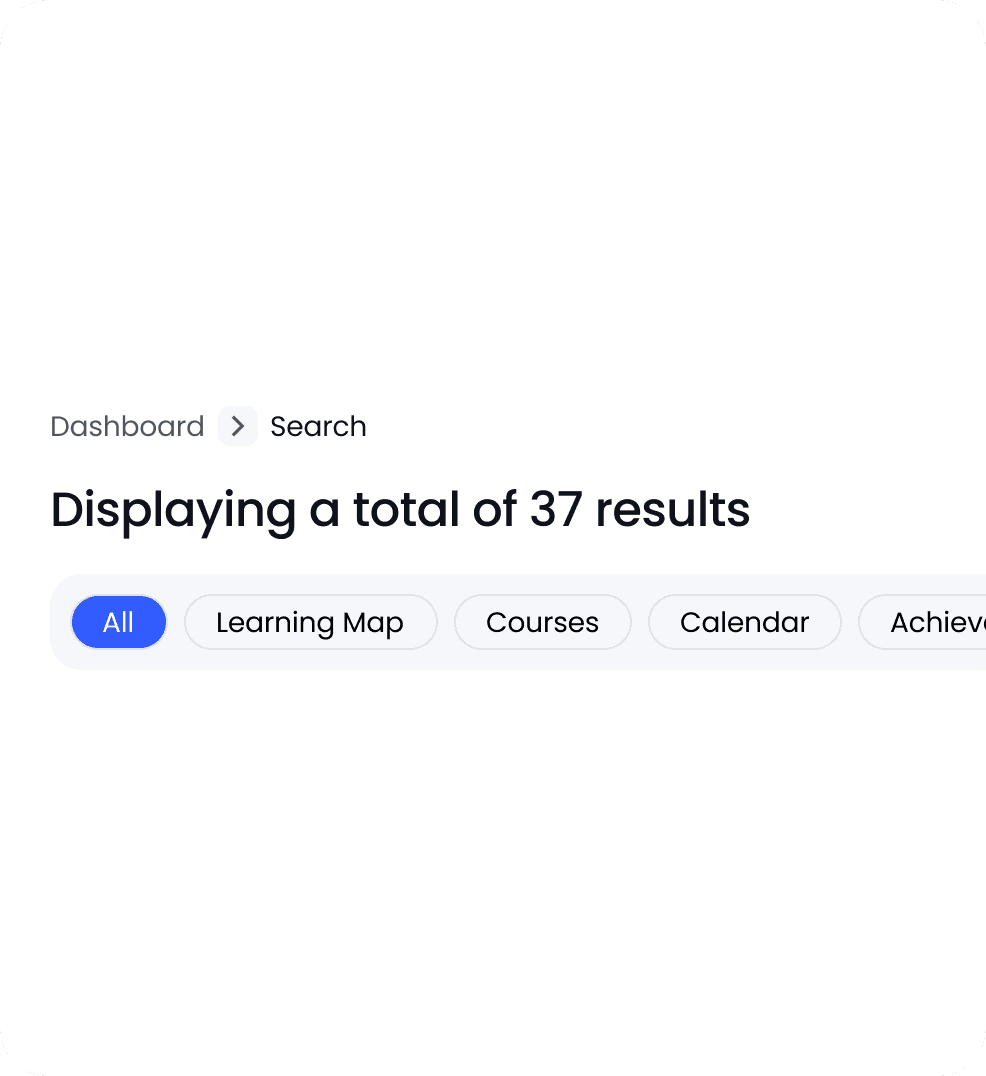

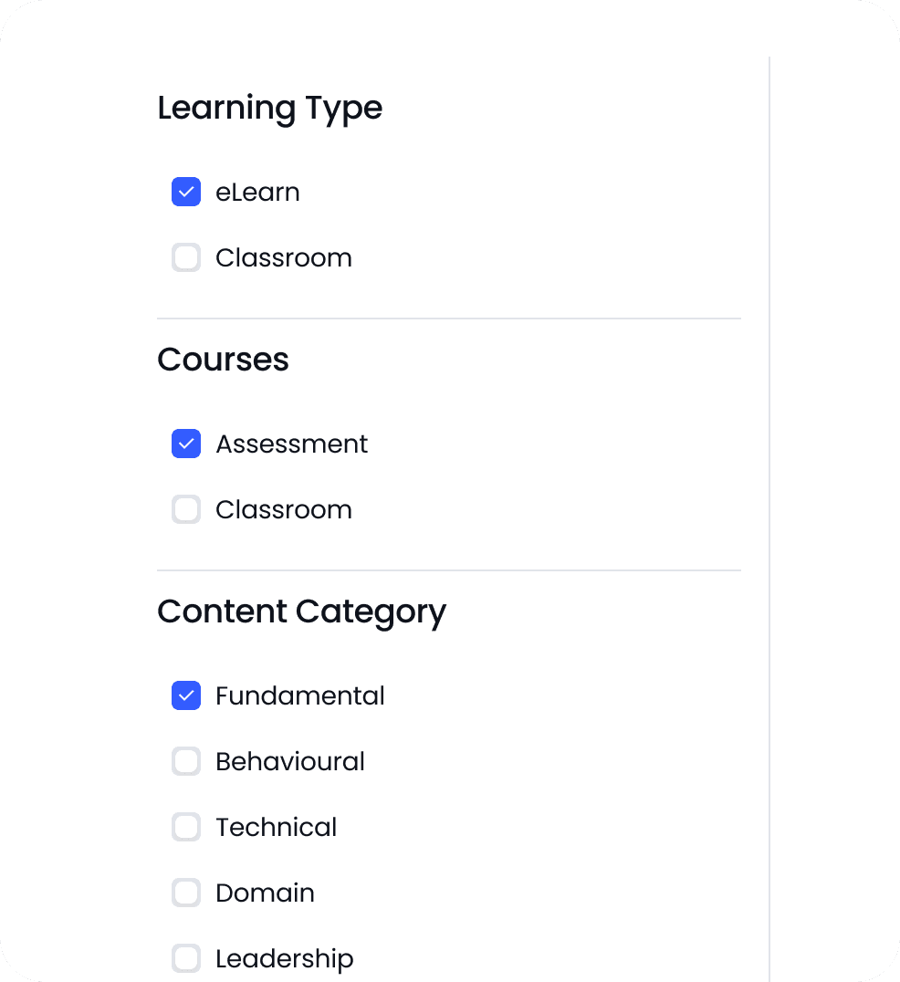

Results are grouped by type, so a search surfaces the right section directly, and scalable filters narrow things down by learning type, category, and skill level. Together these turn discovery from a hunt into a quick, predictable step.
Solution 2
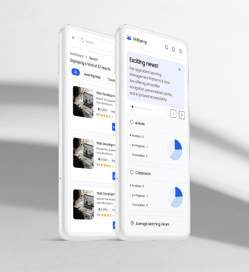
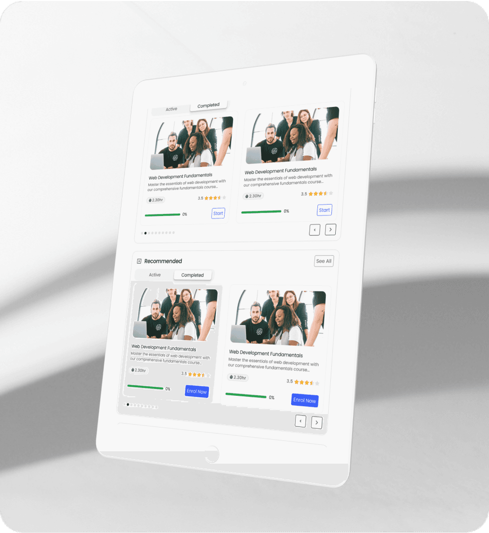
Learning Across Devices
Learners can move between web, tablet, and mobile without losing their place. Progress follows them, so a course started at a desk can continue on a phone later — which is what makes it realistic to fit learning into an actual workday rather than carving out dedicated desktop time.



Solution 3
Driving Engagement & Recognition
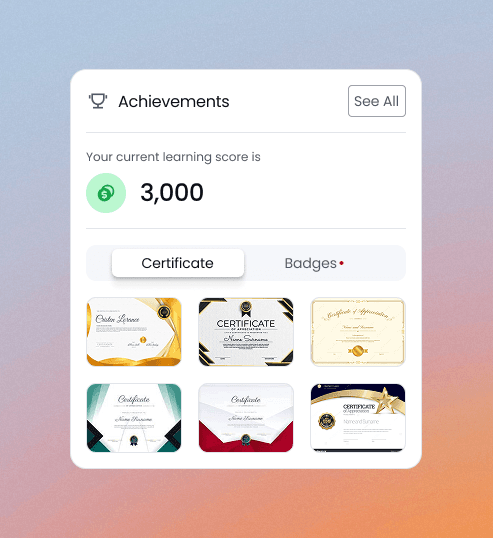
To give people a reason to keep going, I introduced learning points that can be redeemed for rewards, and certificates that let learners show what they've completed. Paired with clear progress tracking, the aim was to make finishing a course feel recognized rather than invisible.



Project Scope & What's Next
This release focused on the employee learning experience — discovering courses and completing them. The manager side was deliberately scoped out to ship the core experience first, and it's the natural next phase:
Let managers create and publish courses
Add assessment creation and evaluation
Introduce assessment creation and evaluation tools
Let managers track their team's progress
Build analytics and reporting dashboards
Deepen recommendations using richer user data
Outcome & Reflections
The decision that shaped everything was making search the front door, not an afterthought. The old platform buried it and forced people to browse — so the catalog got harder to use as it grew. Search-first gave the redesign a spine: discovery, categories, and filters all worked toward getting a learner to the right course faster.
My involvement ended at handoff, as consulting work usually does, so the client owns the post-launch numbers.
Craft & Components
A closer look at the components and details that hold the experience together.